Pre-market Summary Emails Less Useful After Redesign

The redesign of pre-market summary emails looks nicer but has several errors that make them way less useful.
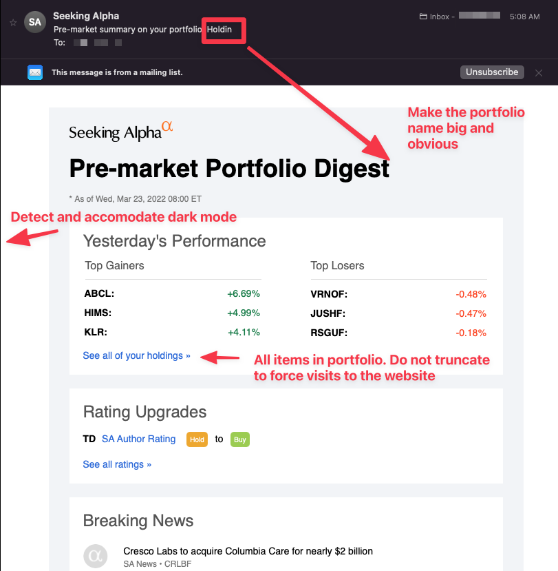
* Put the name of the portfolio in the title, not just the subject. The title appears huge and contains zero information. Add the portfolio title so I can tell which one I'm looking at without scanning the stocks themselves.
* Include all items in the portfolio. Showing the top 3 gainers and losers is really not that helpful. I don't want to visit the site to see the information, I want the information IN THE SUMMARY EMAIL. It's not a summary if I have to go to the site.
This is really a step backwards. The previous format was a bit tight to read but it had what I wanted, which was information. This is nicer to look at but not nearly as useful.