Add average line on all of the new charts

Add an average line on all of the charts for the time period specified. For example, looking a PE Ratio chart for Visa over 5 years, there should be a horizontal line showing the average for the period selected so you can see if it is higher/lower than the average of this period. Same for all of the other charts.

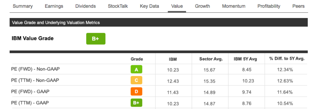
Ok - that Sector Avg and 5Y Avg would certainly be a helpful improvement and that is pretty much what I meant. I still think it would be nice to see this average incorporated into the charts to the extent possible. You could still glean more information from the chart. For example, you could see that for a period of 15 months 3 years ago the PE ratio was below the 5 year average (among other insights). You wouldn't know that from just seeing the numbers.
Thank you for the help and for listening.